Mobile App, Parsnip
Parsnip is a mobile cooking-learning platform designed to help novice cooks build foundational skills through structured, gamified learning.
The product struggled with early user drop-off, limiting activation and long-term retention. I led the redesign of the core learning experience to reduce confusion, reinforce user confidence, and support habit formation through human-centered design.
Role
Product & UX Designer
Timeline
8 months (2022)
Responsabilities
Strategy • UX Architecture • UI Design • Testing • Delivery
Team
PM, User Researcher, Content Writer, Engineers

Problem Statement
Parsnip has seen users drop off before completing sign-up, this was threatening their business.
Solution Impact


30,000+ downloads within 7 months of launch
20–25% weekly retention sustained up to 4 months
4.9⭐ App Store rating (300+ reviews)
User activation rate more than doubled after redesign
Challenge
Despite high-quality content, users dropped off before completing onboarding. Data showed friction early in the experience, threatening long-term growth. Users didn’t lack motivation, they lacked clarity, confidence, and visible progress.
Through interviews, usability testing, and product analytics, we identified three core blockers:
Cognitive overload during first use
Low perceived competence in early learning stages
Insufficient feedback loops to support habit formation
Stage 2. Design Strategy
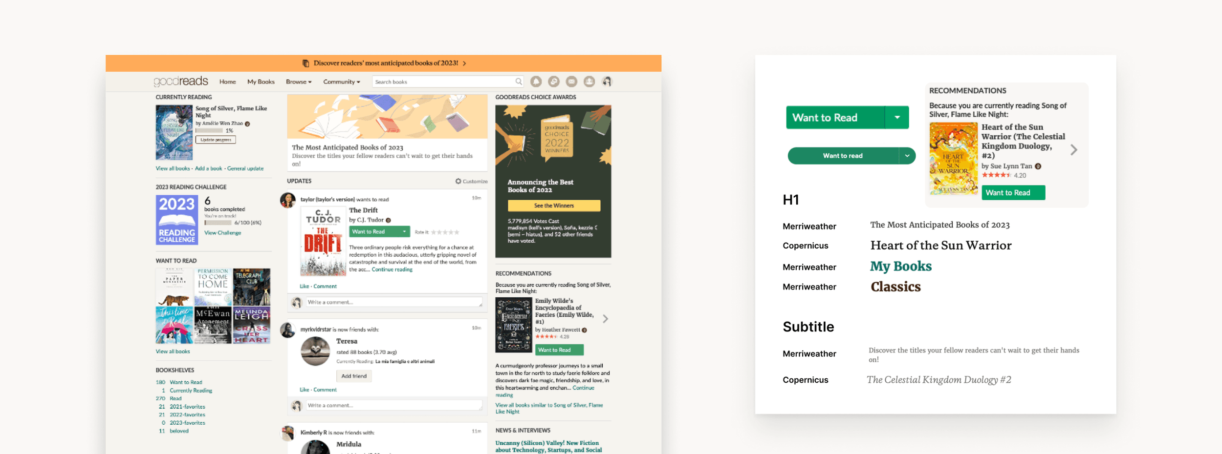
Initiated the project with a comprehensive usability audit of the existing app, employing heuristic evaluation, user interviews, and performance analytics to identify friction points. This audit revealed significant areas for improvement, particularly in the app's navigation system, goal tracking features, and social engagement mechanisms.
How might we
Based on quantitative drop-off data and qualitative user research, we reframed the challenge into a set of How Might We questions to guide ideation and prioritization.
We avoided framing HMWs around features (“How might we add gamification?”) and instead focused on user outcomes (“How might we reinforce confidence and progress?”)
Core Question:
How might we help novice cooks feel confident and motivated enough to continue learning before they feel skilled?
Supporting questions:
How might we help users feel capable even when they make mistakes?
How might we help users quickly find relevant content without overwhelming them with choices?
How might we reduce cognitive load during first use without oversimplifying the learning model?
Design Principles
All solutions were grounded in these principles:
Reduce cognitive load early
Reinforce perceived competence
Make progress visible and meaningful
Treat mistakes as learning moments
Balance motivation with clarity (not gamification for its own sake)
Research & Insights
To understand the root causes of early drop-off, we combined qualitative and quantitative research. We conducted interviews and usability testing with 20 participants, 12 novice cooks and 8 early adopters, evenly split between male and female participants, to uncover their motivations, frustrations, and learning behaviors.
Key Themes

Theme 1
Users wanted to learn cooking systematically, not randomly

Theme 2
Many lacked confidence in basic kitchen techniques

Theme 3
Mistakes during learning felt frustrating rather than educational

Theme 4
Users wanted reassurance they were “doing it right”
Product analytics revealed: Significant drop-off during sign-up and first-session usage. Low completion rates for early learning levels, Reduced engagement after repeated quiz failures.
Key Pain Points
Cognitive overload during first use
Unclear value proposition early in the experience
Lack of feedback explaining why answers were right or wrong
Insufficient motivation signals to support habit formation


Research #1
Quantitative Data via Amplitude
Research #2
User Interviews
Research #3
Usability Testing

Quotes from User Interviews
Design Approach

The project followed an agile, iterative design approach, combining continuous delivery with human-centered discovery. We used a reverse double diamond model, starting with validated problem signals from analytics and user behavior, then rapidly diverging into solutions and converging through testing and iteration.
This approach allowed us to:
Balance business objectives (activation, retention) with user needs (clarity, confidence, motivation)
Ship quickly, learn from real usage, and refine designs based on evidence rather than assumptions
Continuously validate solutions through both qualitative feedback and quantitative metrics
Design, development, and research ran in parallel, enabling fast feedback loops and frequent improvements without sacrificing usability or product quality.
Ideation & Prioritization
The project followed an agile, iterative design approach, combining continuous delivery with human-centered discovery. We used a reverse double diamond model, starting with validated problem signals from analytics and user behavior, then rapidly diverging into solutions and converging through testing and iteration.
This approach allowed us to:
Balance business objectives (activation, retention) with user needs (clarity, confidence, motivation)
Ship quickly, learn from real usage, and refine designs based on evidence rather than assumptions
Continuously validate solutions through both qualitative feedback and quantitative metrics
Design, development, and research ran in parallel, enabling fast feedback loops and frequent improvements without sacrificing usability or product quality.


Keep in mind that communicating to users “You’re doing great and making huge progress.”, multiple ideas that cater to 3 main flows in our app.
Key Design Solutions
Final Hi-Fis
The final high-fidelity represents a part of the refined, end-to-end redesign of Parsnip’s core learning experience, focused on reducing early-stage confusion, reinforcing user confidence, and supporting long-term habit formation. All design decisions were informed by user research, behavioral insights, and iterative validation, ensuring that the experience balanced clarity, motivation, and learning effectiveness.
Onboarding
Early user research and product data revealed that users struggled to understand how the app worked and why it was valuable during their first interaction. This confusion often resulted in early drop-off before users could experience the benefits of the learning model.
To address this, the onboarding experience was redesigned to demonstrate value through action rather than explanation.
Sample-level gameplay was introduced to allow users to immediately experience the learning flow without commitment.
Just-in-time guidance replaced front-loaded instructions, surfacing help only when it was relevant to the user’s current action.
Dish selection was also contextualized to help users understand how each choice fit into their broader learning journey.


Together, these changes reduced cognitive load, clarified the product’s value proposition, and significantly improved user activation.
Quizz Flow
The original quiz experience provided limited feedback and often felt punitive, which led to frustration and disengagement during learning. Users were unsure why answers were correct or incorrect, and repeated mistakes undermined confidence.
The redesigned quiz flow focused on transforming mistakes into learning opportunities. Clear explanations were added to all answers to reinforce understanding and support skill development. Visual narrowing, such as greying out incorrect options, helped users learn through elimination and reduced frustration on subsequent attempts.
An encouraging and supportive tone was applied throughout the experience to normalize mistakes as a natural part of learning. As a result, users completed levels more efficiently, experienced less friction during quizzes, and reported greater confidence in their learning progress.


Gamification
While users appreciated the learning concept, many lacked the motivation to return consistently and form a sustainable habit. Gamification was introduced as a supportive layer to reinforce engagement without distracting from learning.
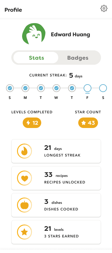
Streaks and badges were designed to reward consistency and mastery rather than one-off performance.
Profile-level statistics reflected ongoing progress, allowing users to see tangible evidence of skill growth over time.
Achievements were intentionally framed around learning and improvement instead of point accumulation, reinforcing intrinsic motivation.
These changes contributed to stronger habit formation and helped sustain weekly retention over multiple months.

Validation & Metrics
The redesigned experience was validated through a combination of quantitative product metrics and qualitative user feedback collected after launch. Performance data showed a clear improvement across key activation and engagement indicators. User activation more than doubled following the introduction of the redesigned onboarding and learning flows, confirming that early confusion had been successfully reduced. Weekly retention stabilized between 20–25% and remained consistent for up to four months, indicating stronger habit formation and sustained engagement over time.
In addition to behavioral metrics, user sentiment provided strong validation of the design decisions. The app maintained a 4.9-star rating on the App Store with over 300 reviews, many of which highlighted the intuitive onboarding, confidence-building feedback, and motivating learning structure. Users frequently noted that the experience felt natural and easy to follow, often without consciously noticing the redesign itself — a signal that usability improvements were well integrated into the product.
Together, these results demonstrated that focusing on cognitive clarity, perceived competence, and meaningful progress directly contributed to measurable product growth.

Grow the audience, grow with our product

Reflection
This project reinforced the importance of designing for confidence before mastery in skill-based learning.
If continuing this work, I would:
Personalize learning paths based on early performance signals
Expand social features without undermining solo learner confidence
Continue evolving the design system as a product using an atomic approach
This project demonstrates my ability to design human-centered systems, collaborate cross-functionally, and deliver measurable product impact at scale.
