Goodreads Design System
Goodreads is a social cataloging platform that enables readers to organize their digital bookshelves, track reading progress, and connect through ratings and reviews.
As the product and organization grew, the website accumulated design inconsistencies that began to impact usability, development velocity, and overall product cohesion. This case study documents the creation of Storyteller, a UX-focused design system built to bring clarity, consistency, and scalability to the Goodreads web experience.
Role
Lead UX Designer
Timeline
12 weeks (2023)
Responsabilities
Strategy • Branding • UI design
Documenting & Governance
Team
4 UX Designers

Why a design system?
As teams scale, every new hire and project introduces more variation. Business pressure to ship faster often leads to duplicated patterns, fragmented UI decisions, and inconsistent experiences.
A design system establishes shared standards that:
Reduce cognitive load for users
Improve onboarding for designers and engineers
Accelerate product development
Enable consistency across teams and features


Challenge
During my audit of the existing Goodreads website, I identified systemic inconsistencies that negatively impacted both user experience and team velocity:
12 different button styles
26 font variations across sizes and weights
Duplicated common components
Visual inconsistencies between the homepage and multiple microsites
These inconsistencies posed a clear risk to the upcoming launch and made it difficult for designers and engineers to move quickly with confidence.
I began actively tracking these issues and recognized that addressing them individually would not scale. This led me to propose and lead the creation of a centralized, UX-driven design system that could serve as a single source of truth across the organization.
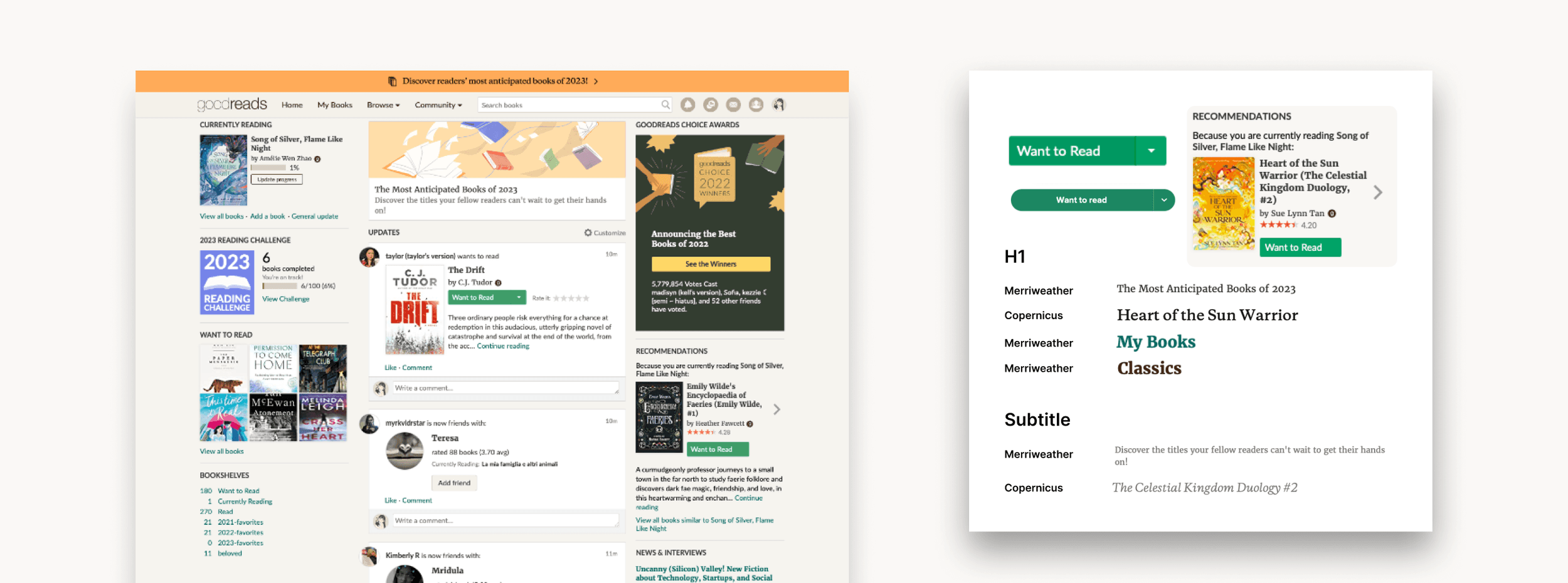
Deconstructing the Existing Experience
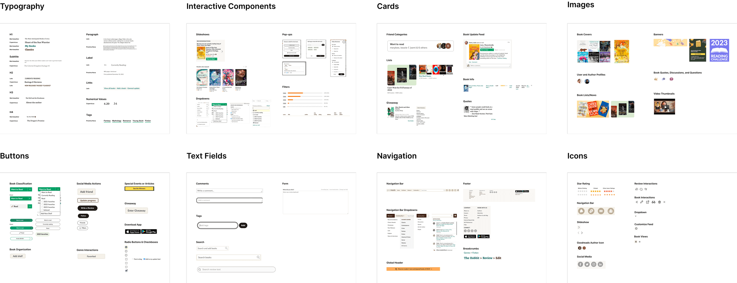
To understand the scope of the problem, we cataloged every distinct UI element and component used across the site. By reviewing all visual treatments side-by-side, we:
Identified overlapping and redundant patterns
Uncovered gaps in hierarchy and behavior
Gained a holistic view of how inconsistency affected usability
This audit became the foundation for defining what should exist moving forward.
Constraints and Trade Offs
The system needed support an active product relaunch, limiting time for full refactors
Legacy patterns could not be fully removed upfront, requiring incremental adoption.
Buy in varied across teams, so documentation and clarity were critical for adoption.
As a result, I focused first on stabilizing core components and foundations, deferring edge-case patterns to later phases.
Voice and Tone
Goodreads’ brand is rooted in storytelling, curiosity, warmth, and trust. To translate this into UI decisions, we distilled the brand into guiding principles that informed everything from typography to interaction patterns.
Familiar and welcoming rather than flashy
Calm and readable and content-first
Consistent and predictable interactions
These values ensured the design system supported the reading experience rather than competing with it.
Application Guidelines & System Architecture (Atomic Design)
For this project, the Storyteller Design System was scoped to the Goodreads website. The system was designed to: scale across existing and future web pages, support responsive layouts and be extensible by internal teams and third-party contributors.
We structured the design system using Atomic Design, enabling a modular, scalable, and well-documented approach.

This structure allowed both designers and engineers to: understand component ownership, reuse patterns confidently, extend the system without breaking consistency
Final Versions


Grids & Spacing
Responsive grid systems for desktop and mobile
Spacing based on 8-point increments
Clear rules for hierarchy, rhythm, and layout balance
Color & Typography
Unified color palette retaining Goodreads’ primary green
Scalable color system for hierarchy and flexibility
WCAG 2.1–compliant contrast ratios
Standardized typography scales for readability and consistency
Building the System

Storyteller - Atoms
Atoms
The smallest functional building blocks (e.g. buttons, inputs, text styles).
Molecules
Combinations of atoms forming reusable UI patterns (e.g. form fields, list items).
Organisms
Groups of molecules and atoms forming functional sections (e.g. headers, cards, content blocks).
Templates & Pages
Consistent layouts that define structure across multiple pages, enabling faster iteration and predictable experiences.
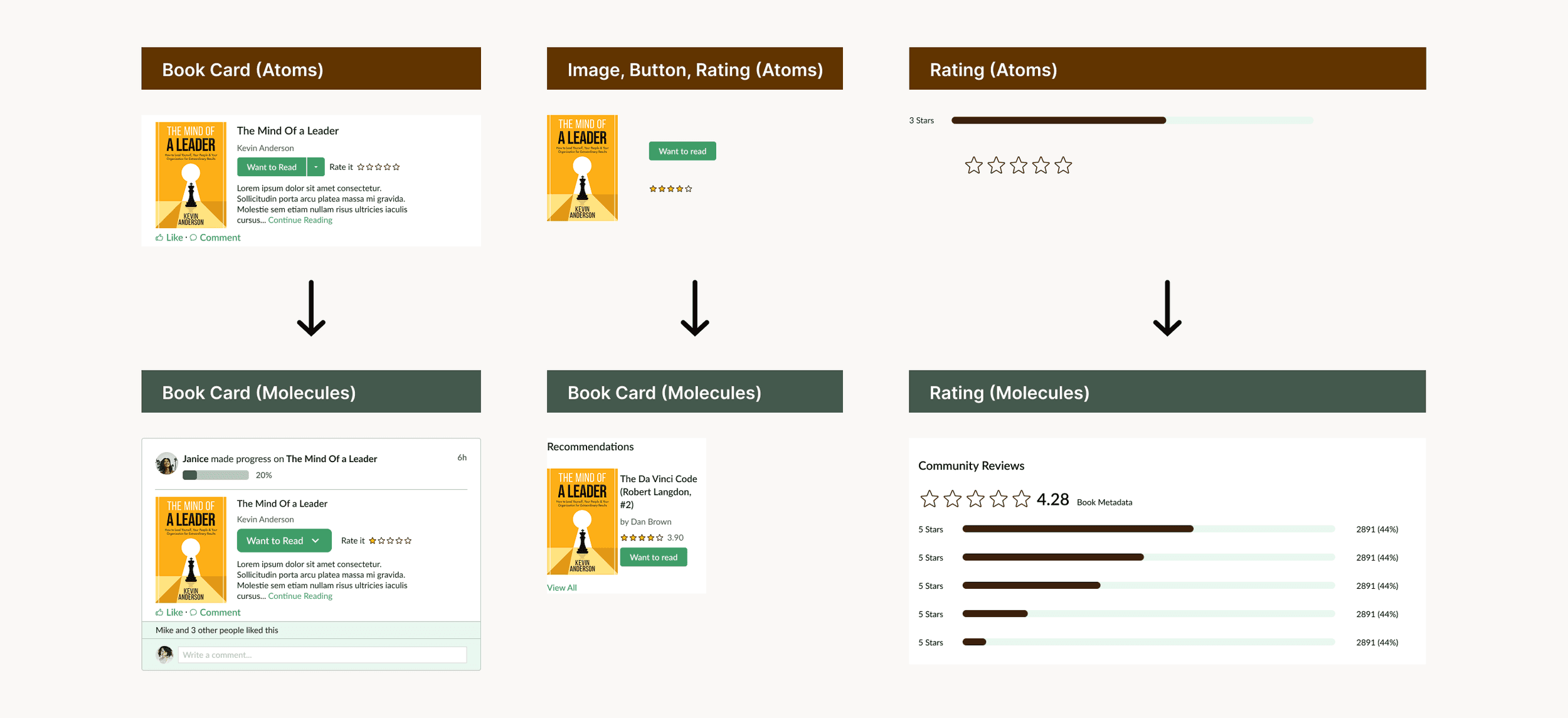
Storyteller - Molecules

Storyteller - Organisms

Storyteller - Templates & Pages


Auto Layout
Used to ensure responsiveness and flexible component behavior across breakpoints.
Components and variants
Built using Figma variants, supported multiple states (hover, disabled, active), reduced duplication and improved consistency
Design Technologies and Tooling

Figma Community Library for easy access and reuse.
Zeroheight documentation for onboarding guides, accessibility standards, contribution rules, governance guidelines.
The documentation followed familiar conventions to ensure smooth adoption by designers, engineers, and stakeholders.
Outcomes and Impacts
Significantly reduced the UI inconsistency across core website flows, enabled teams to move faster with fewer design and implementation questions, created a shared source of truth across disciplines, unblocked the website relaunched with a more cohesive experience. While not all legacy patterns were replaced immediately the system established a clean path toward long-term consistency and scalability.
Key Learnings
Design systems are living products — they require ownership and iteration
Adoption is as important as creation — buy-in must be intentional
Accessibility is MVP — defining standards early prevents costly rework later


Design systems are living products, they require ownership and iteration
Adoption is as important as creation, buy-in must be intentional
Accessibility is MVP, defining standards early prevents costly rework later
Final Versions
